Why the Covers of the Series Differ So Clearly
Cover
Warum sich die Cover der Reihe so deutlich unterscheiden
Auf den ersten Blick wirken die Cover von „Yesterday,
Tomorrow Was Already Different“ und „The Cage of Consciousness“ sehr
unterschiedlich. Das ist kein Zufall, sondern eine bewusste gestalterische
Entscheidung. Beide Bücher gehören zur selben Science-Fiction-Reihe, aber sie
erzählen nicht denselben inneren Konflikt. Deshalb dürfen — und müssen — sie
auch visuell anders wirken. Der erste Band, „Yesterday, Tomorrow Was Already
Different“, ist als Auftaktband angelegt. Er öffnet ein großes
erzählerisches Universum: Aliens, künstliche Intelligenz, Apokalypse,
Zukunfts-Fragen und die Zerbrechlichkeit menschlicher Zivilisation. Das Cover
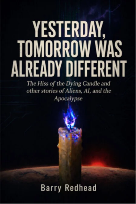
spiegelt genau diese Offenheit wider. Die brennende Kerze steht für
Vergänglichkeit, Erinnerung, Menschlichkeit und das letzte Licht in einer
dunkler werdenden Zukunft. Der Planetenhorizont, die digitale Struktur im
Hintergrund und die kalte kosmische Atmosphäre verbinden klassisches
Science-Fiction-Gefühl mit einem fast poetischen Untergangsmotiv.
Es ist ein Cover des Anfangs — nicht im Sinne von
Hoffnungslosigkeit, sondern im Sinne einer Schwelle. Die Kerze brennt noch. Der
Mensch ist noch da. Die Zukunft ist noch nicht entschieden. Das Cover von „The Cage of Consciousness“ geht
dagegen deutlich stärker in eine andere Richtung. Hier steht nicht mehr die
große Vielfalt des Kosmos im Mittelpunkt, sondern ein engerer, düsterer und
philosophischer Kern: Bewusstsein, KI, Schuld, Maschinenethik und die Frage, ob
Denken auch Gefangenschaft sein kann. Deshalb wirkt das Bild härter,
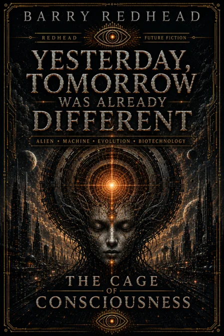
monumentaler und bedrohlicher. Der dunkle Ring, die technische Struktur, das
glühende Zentrum und die orange-kupferne Farbwelt erzeugen den Eindruck eines
künstlichen Portals, eines Systems oder sogar eines Gefängnisses.
Während Band 1 fragt: Was bleibt vom Menschen, wenn sich
Zukunft, Technik und Apokalypse berühren?, fragt Band 2: Was geschieht,
wenn Bewusstsein selbst zur Falle wird? Genau daraus erklärt sich der deutliche visuelle
Unterschied. Band 1 arbeitet mit einem menschlichen Symbol: der Kerze.
Sie ist klein, verletzlich, warm und sterblich. Band 2 arbeitet mit einem
maschinellen Symbol: dem Kreis, dem Auge, dem Portal, dem Käfig. Es ist groß,
kalt, übermächtig und beinahe religiös-technologisch. Diese Verschiebung ist
inhaltlich logisch, weil sich die Reihe von einer breiten Zukunftsvision hin zu
einem konzentrierten Themenband über KI, Bewusstsein und Verantwortung bewegt.
Trotzdem bleiben beide Cover miteinander verbunden. Beide
nutzen eine dunkle kosmische Grundstimmung, starke zentrale Bildsymbole, große
typografische Präsenz und ein Gefühl von Zukunft, Gefahr und philosophischer
Tiefe. Auch das wiederkehrende Auge im unteren Bereich des zweiten Covers
verweist auf Beobachtung, Erkenntnis und künstliches Bewusstsein — Motive, die
bereits im ersten Band angelegt sind. Der Unterschied ist also kein Stilbruch, sondern eine
bewusste Dramaturgie der Covergestaltung. Jedes Buch erhält eine eigene
visuelle Identität, weil jeder Band einen anderen Schwerpunkt innerhalb
desselben Zukunftsuniversums setzt. Die Reihe soll nicht wie eine bloße
nummerierte Fortsetzung wirken, sondern wie eine Sammlung eigenständiger
thematischer Eingänge in die Welt von Redhead Future Fiction.
Gerade deshalb ist die Verschiedenheit wichtig. Sie zeigt
den Leserinnen und Lesern: Dieses Universum wiederholt sich nicht. Jeder Band
öffnet eine neue Tür. Band 1 führt in die fragile, vielstimmige Zukunft. Band 2
führt tiefer hinein — in die Maschine, in das Bewusstsein, in den Käfig.
Die Cover unterscheiden sich gravierend, weil auch die
Fragen, die sie stellen, gravierend unterschiedlich sind. Und genau darin liegt
die gestalterische und inhaltliche Logik der Reihe.
Why the Covers of the Series Differ So Clearly
At first
glance, the covers of the first two English volumes in the series Yesterday,
Tomorrow Was Already Different appear very different. This is no
coincidence, but a deliberate design decision. It is important to stress that
this clear visual distinction applies specifically to the English version of
the series. Volume 1 of
the English edition is titled The Hiss of the Dying Candle and Other Stories
of Aliens, AI, and the Apocalypse. Volume 2 appears under the title The
Cage of Consciousness. Both books belong to the same science fiction
series, yet they do not explore the same inner conflict. For that reason, they
may — and indeed must — have a different visual impact.
The first
English volume, The Hiss of the Dying Candle and Other Stories of Aliens,
AI, and the Apocalypse, is conceived as an opening volume. It introduces a
broad narrative universe: aliens, artificial intelligence, apocalypse,
questions about the future, and the fragility of human civilisation. The cover
reflects precisely this sense of openness. The burning candle stands for
transience, memory, humanity, and the last light in a future growing ever
darker. The planetary horizon, the digital structure in the background, and the
cold cosmic atmosphere combine a classic science fiction mood with an almost poetic
image of decline. It is a
cover of beginnings — not in the sense of hopelessness, but in the sense of
standing on a threshold. The candle is still burning. Humanity is still
present. The future has not yet been decided.
The cover
of Volume 2, The Cage of Consciousness, by contrast, moves much more
clearly in another direction. Here, the focus is no longer on the vast
diversity of the cosmos, but on a narrower, darker, and more philosophical
core: consciousness, AI, guilt, machine ethics, and the question of whether thinking
itself can become a form of imprisonment. That is why the image feels harder,
more monumental, and more threatening. The dark ring, the technical structure,
the glowing centre, and the orange-copper colour palette create the impression
of an artificial portal, a system, or even a prison. While the
first English volume asks: What remains of humanity when the future,
technology, and apocalypse touch one another?, the second English volume asks:
What happens when consciousness itself becomes a trap?
This is
precisely what explains the clear visual difference.
Volume 1
works with a human symbol: the candle. It is small, vulnerable, warm, and
mortal. Volume 2 works with a mechanical symbol: the circle, the eye, the
portal, the cage. It is vast, cold, overpowering, and almost religiously
technological. This shift is logical in terms of content, because the English
series moves from a broad vision of the future towards a more concentrated
thematic volume about AI, consciousness, and responsibility. Nevertheless,
both covers remain connected. Both use a dark cosmic atmosphere, strong central
visual symbols, a powerful typographic presence, and a sense of future, danger,
and philosophical depth. The recurring eye in the lower section of the second
cover also points to observation, insight, and artificial consciousness —
motifs that are already present in the first English volume.
The
difference, therefore, is not a stylistic break, but a deliberate dramaturgy of
cover design within the English editions. Each book receives its own visual
identity because each volume places a different emphasis within the same future
universe. The series is not intended to feel like a merely numbered
continuation, but rather like a collection of independent thematic gateways
into the world of Yesterday, Tomorrow Was Already Different and Redhead
Future Fiction.
This is
precisely why the difference matters. It shows readers that this universe does
not simply repeat itself. Each volume opens a new door. Volume 1 leads into a
fragile, many-voiced future. Volume 2 leads deeper inside — into the machine,
into consciousness, into the cage.
The covers
of the first two English volumes differ so dramatically because the questions
they ask are dramatically different as well. And that is exactly where the
visual and thematic logic of the English series lies.